During this cycle, we were able to address many issues and feature requests. This post is a round up of the latest changes from our repository that add improvements to Forem.
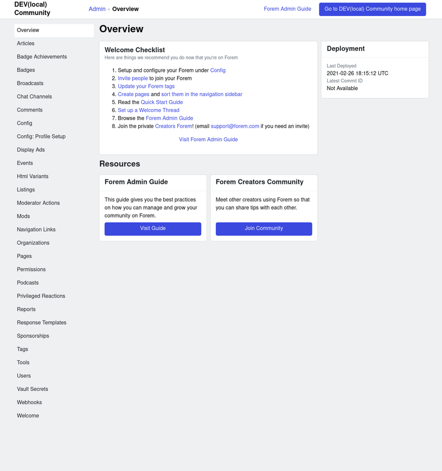
Add Admin Overview Page
This PR Replaces the tiles in "Admin Portals" with a new view called "Overview" as a step toward a more complete overhaul of the UI.
 Add admin overview page
#12726

What type of PR is this? (check all applicable)
- [ ] Refactor
- [x] Feature
- [ ] Bug Fix
- [ ] Optimization
- [ ] Documentation Update
Description
Replaces the tiles in "Admin Portals" with a new view called "Overview" as a step toward a more complete overhaul of the UI.
Related Tickets & Documents
Solves RFC: https://github.com/forem/rfcs/pull/39/files
QA Instructions, Screenshots, Recordings
(A few of the links from the mockup were removed during this PR)
UI accessibility concerns?
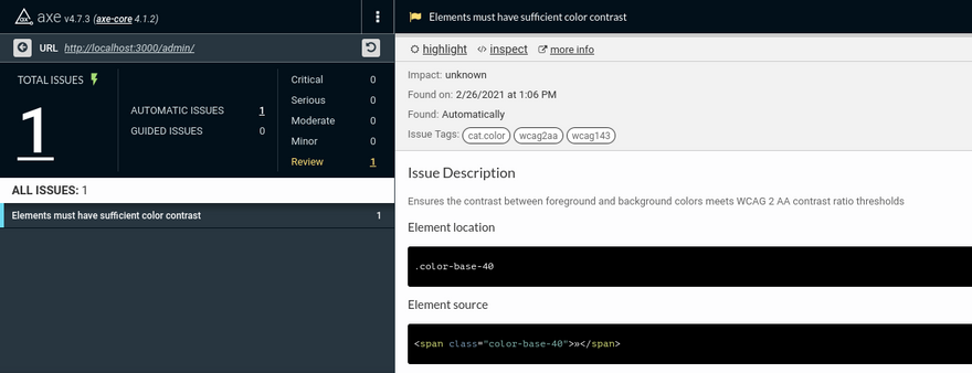
Axe isn't happy with the color contrast. FIXED
Added tests?
- [x] Yes
- [ ] No, and this is why: please replace this line with details on why tests have not been included
- [ ] I need help with writing tests
[Forem core team only] How will this change be communicated?
Will this PR introduce a change that impacts Forem members or creators, the development process, or any of our internal teams? If so, please note how you will share this change with the people who need to know about it.
- [ ] I've updated the Developer Docs and/or Admin Guide, or Storybook (for Crayons components)
- [ ] I've updated the README or added inline documentation
- [ ] I will share this change in a Changelog or in a forem.dev post
- [x] I will share this change internally with the appropriate teams
- [ ] I'm not sure how best to communicate this change and need help
- [ ] This change does not need to be communicated, and this is why not: please replace this line with details on why this change doesn't need to be shared
Publicly Indicate if Someone Edits Their Comments
This PR publicly indicates if a user edits their comment to help prevent gaslighting in situations such as:
“User A says something, then User B responds, User A modifies their comment so that User B’s response doesn’t make sense.”
 Publicly indicate if someone edits their comments
#10524

Signed-off-by: Efereyan Karen Simisola thedevkaren@gmail.com
What type of PR is this? (check all applicable)
- [ ] Refactor
- [x] Feature
- [ ] Bug Fix
- [ ] Optimization
- [ ] Documentation Update
Description
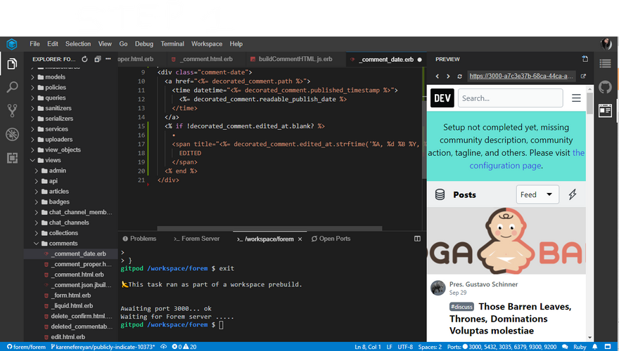
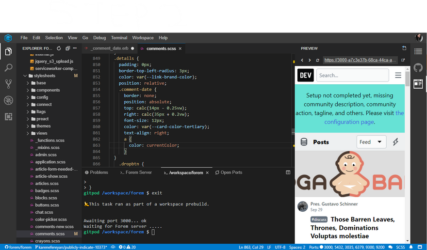
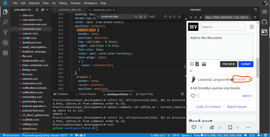
This PR aims to add a public indication of edited comments. This prevents gaslighting. It's helpful to stop situations where User A says something, then User B responds, User A modifies their comment so that User B’s response doesn’t make sense. Ideally, if someone edits their comments, we should publicly indicate it in the comment with the word "(edited)" appearing near the date of the comment.
Related Tickets & Documents
Closes #10373
QA Instructions, Screenshots, Recordings
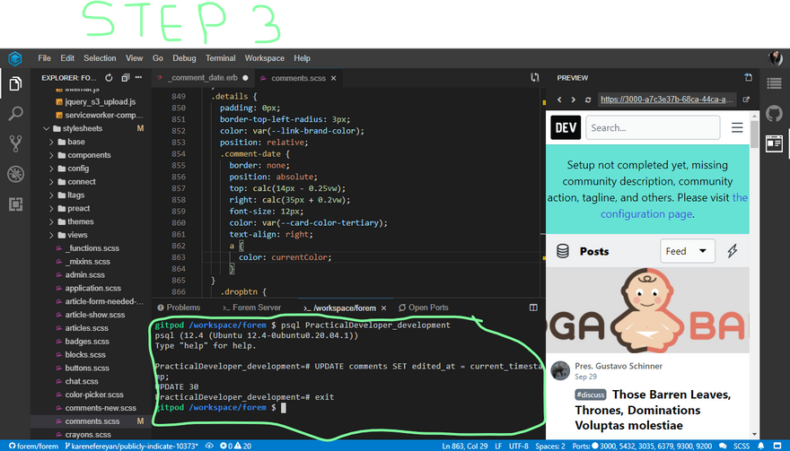
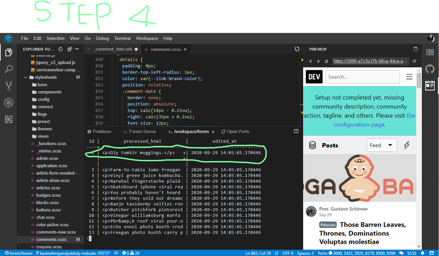
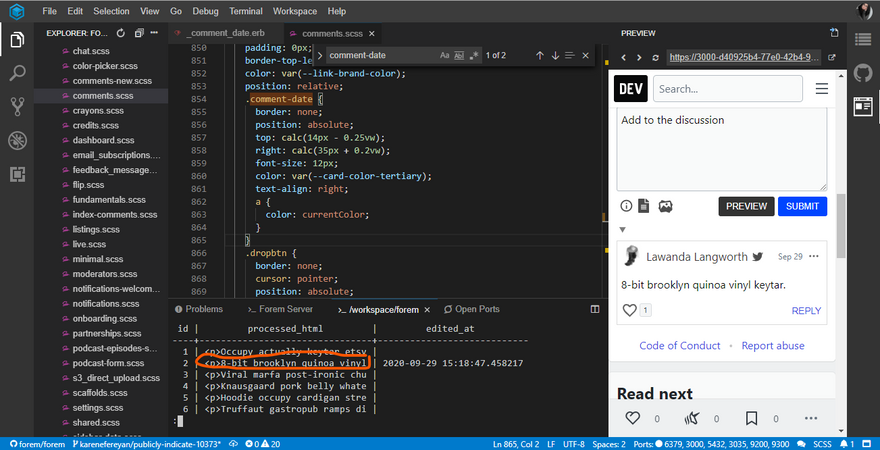
Follow these steps to test the changes(These commands should be run via the terminal)
psql PracticalDeveloper_development-
select id, LEFT(processed_html, 30) as processed_html, edited_at from comments order by id;(This returns a list of comments ordered by id. The id of the specific comment to be edited should be noted as it will go into the parenthesis in the next command) -
update comments set edited_at = current_timestamp where id in (id of comment to be edited);(This should return the keyword UPDATED along with the number of comments that were updated select id, LEFT(processed_html, 30) as processed_html, edited_at from comments order by id;exit
Once the preview is loaded again, the edited span should be added to the comment that was just edited
The following images illustrate the changes
Added tests?
- [x] yes
- [ ] no, because they aren't needed
- [ ] no, because I need help
Added to documentation?
- [ ] docs.forem.com
- [ ] readme
- [x] no documentation needed
[optional] Are there any post deployment tasks we need to perform?
[optional] What gif best describes this PR or how it makes you feel?
Improve Overall Accessibility of Modals
This PR addresses several accessibility bugs found by our team and contributors. This specifically relates to the listings modal, the admin modals (for profile fields and navigation links), and the "Log in to continue" modal. It also adds an open/close toggle state.
 improve keyboard accessibility of modals 12427 10610
#12511

What type of PR is this? (check all applicable)
- [X] Refactor
- [ ] Feature
- [X] Bug Fix
- [ ] Optimization
- [ ] Documentation Update
Description
This PR has two major strands:
- Updates non-Crayons modals to use the Preact Crayons Modal. This specifically relates to the listings modal, the admin modals (for profile fields and navigation links), and the "Log in to continue" modal that's presented in many cases where a user isn't signed in (e.g. on bookmark or 'reply' click)
- Rolls out focus-trap functionality to all Preact Crayons modals including those noted above.
It also adds an open/close toggle state to the Storybook Preact Modal component, along with accessibility notes.
What this PR doesn't cover:
- The
focus-traplibrary currently doesn't work within an iframe. This means that the focus trap hasn't been added to the Mod 'flag user' modal, or the Storybook HTML variant - I'll raise a separate ticket to cover this shortly - Modals triggered by liquid tags (relevant to the user subscribe and poll liquid tags). These will require some further thought/work - I'll raise a separate ticket to cover this too
- I haven't included the delete modal triggered from the connect chat UI, since it isn't reachable by keyboard yet and should be covered in the broader accessibility refactors for that section
Related Tickets & Documents
- Closes #12427
- Closes #12794
- Closes #12771
- Covers most of #10610 (rate limit modals to follow later)
QA Instructions, Screenshots, Recordings
In each of the modal cases above, the following should happen:
- When a button is clicked that triggers a modal to open, focus is immediately moved to the first interactive element in the modal
- While the modal is open, pressing the
Tabkey orShift + Tabcycles through the interactive elements in the modal and ignores any in the background - When the modal is open and the user presses the
Escapekey, the modal closes and focus is sent back to the activating button - When the modal is open and the user clicks a button that closes the modal, focus is sent back to the activating button
- In the case of the listings modal, clicking outside of the modal area should close it (maintaining previous behaviour)
UI accessibility concerns?
This PR introduces accessible focus management for the modals noted above, test steps should be checked with keyboard navigation alone as well as with mouse usage.
Added tests?
- [X] Yes - tests added for the Preact modal, and Cypress tests added for the "log in to continue" modal
- [ ] No, and this is why: please replace this line with details on why tests have not been included
- [ ] I need help with writing tests
Added to documentation?
- [ ] Developer Docs and/or Admin Guide
- [ ] README
- [ ] No documentation needed
- [X] Storybook component docs
[optional] Are there any post deployment tasks we need to perform?
[optional] What gif best describes this PR or how it makes you feel?
Show Relevant #help Posts in Homepage Sidebar
This PR is part one of a two-part solution to ensure that posts show beneath the tags in the homepage's right hand sidebar, regardless of the Forem's size and the article's published_at date, score, and comment_count.
 Part 1: Shows Relevant #help Posts in Homepage Sidebar
#12670

What type of PR is this? (check all applicable)
- [ ] Refactor
- [x] Feature
- [x] Bug Fix
- [ ] Optimization
- [ ] Documentation Update
Description
The "Definition of Done" for this RFC is:
This feature is deployed to all Forems, and we can assert that every size Forem, regardless of Forem size, can render articles on the sidebar. We should be able to see that every Forem (even if those that have few posts or old posts) can always display posts for a tag, regardless of an article's
published_atdate orscore.
This PR is part one of a two-part solution to ensure that posts show beneath the tags in the homepage's righthand sidebar, regardless of the Forem's size and the article's published_at date, score, and comment_count. The first part of this two-part solution focuses specifically on the #help tag in the homepage's righthand sidebar. To accomplish this, I've updated the active_help scope the Article model. This scope is responsible for determining which posts to show under the #help tag found in the homepage's righthand sidebar. In addition to this, I've added a test for this work to spec/models/article_spec.rb.
Related Tickets & Documents
Relates to RFC 20
QA Instructions, Screenshots, Recordings
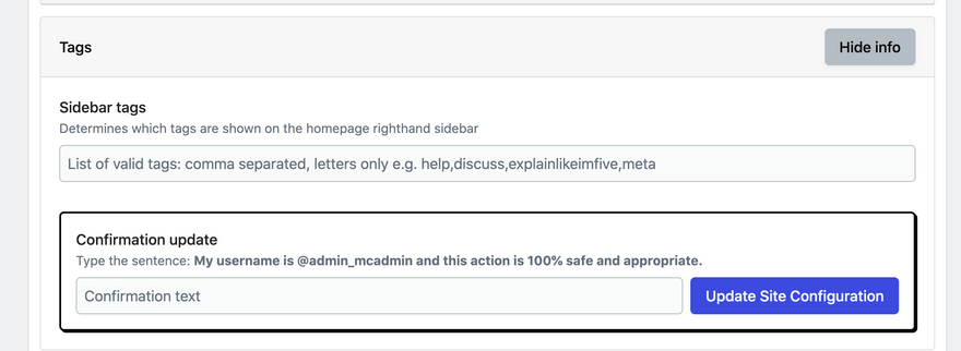
- To QA this PR, please first ensure that you have admin-status and then navigate to
/admin/configand scroll to the/tagssection:
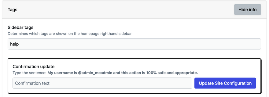
- In order to have tags display in the sidebar and to test this PR, you need to first set some tags, like "help" (
⚠️ in order to test this, you will need to set the "help" tag!):
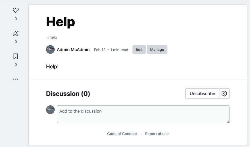
- After setting the tags, navigate to the homepage and observe that there are no articles beneath the "help" tag:
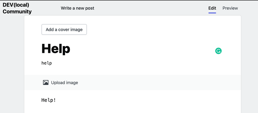
- In order to see articles displayed beneath the "help" tag, create a post that uses the "help" tag:
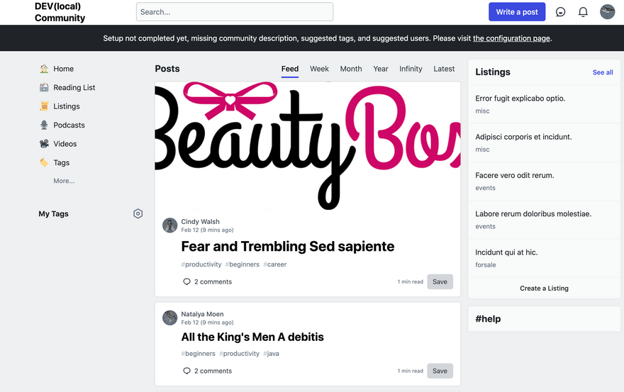
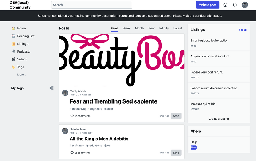
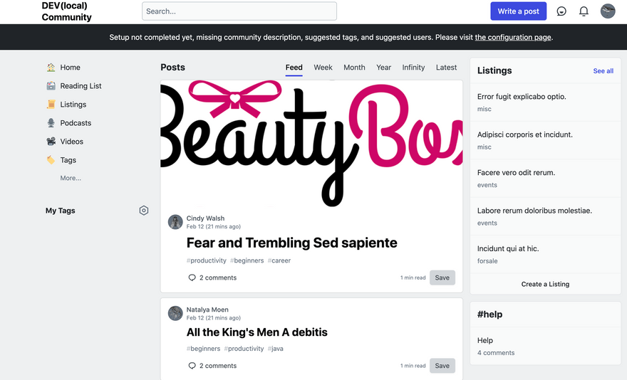
- After creating an article with the "help" tag, navigate back to the homepage. Observe that your article tagged with "help" displays in the sidebar:
- To test that the article tagged with "help" displays in the sidebar as expected if it meets the
#active_helprequirements, first drop into the console and update the article to matchwhere(published_at: 12.hours.ago.., comments_count: ..5, score: -3..):
article = Article.last
article.update(comments_count: 5, published_at: 13.hours.ago, score: -3)
- After updating the article, navigate back to the homepage. Observe that your article shows in the sidebar as expected:
- Try to break things!
⚒️
UI accessibility concerns?
I don't believe so!
Added tests?
- [x] Yes
- [ ] No, and this is why: please replace this line with details on why tests have not been included
- [ ] I need help with writing tests
[Forem core team only] How will this change be communicated?
Will this PR introduce a change that impacts Forem members or creators, the development process, or any of our internal teams? If so, please note how you will share this change with the people who need to know about it.
- [x] I've updated the Admin Guide
👀 I've added documentation to the Admin Guide. The draft can be found here. Any and all feedback welcome! - [ ] I've updated the README or added inline documentation
- [ ] I will share this change in a Changelog or in a forem.dev post
- [x] I will share this change internally with the appropriate teams
- [ ] I'm not sure how best to communicate this change and need help
- [ ] This change does not need to be communicated, and this is why not: please replace this line with details on why this change doesn't need to be shared
[optional] Are there any post-deployment tasks we need to perform?
This will need to be deployed to all Forems.
[optional] What gif best describes this PR or how it makes you feel?
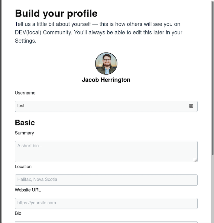
Add Username While Onboarding
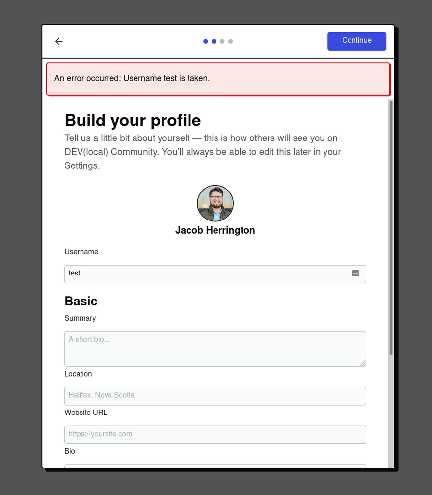
This PR allows a new user to change their username during the onboarding flow.
 Add username to onboarding
#12697

What type of PR is this? (check all applicable)
- [ ] Refactor
- [x] Feature
- [ ] Bug Fix
- [ ] Optimization
- [ ] Documentation Update
Description
This change will allow a new user to change their username in onboarding.
Related Tickets & Documents
Solves RFC: https://github.com/forem/rfcs/pull/47
QA Instructions, Screenshots, Recordings
Onboarding with OAuth: https://www.loom.com/share/0c9e4dd792544264bfc11140d339bd04 Onboarding with Email: https://www.loom.com/share/7a64332c27244de4b345b09f7c3e0662
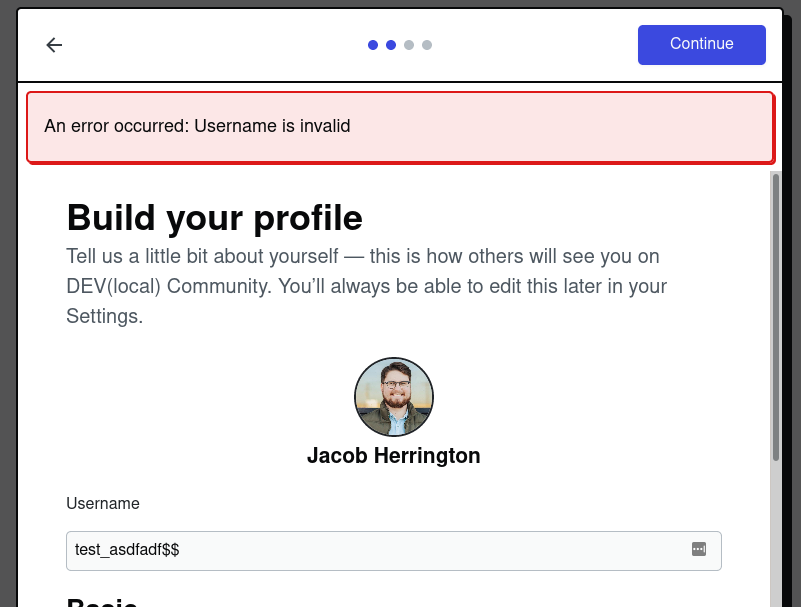
When the username is unavailable:
There might be some opportunity to add front-end validation here, but the way we submit this form is a little odd so I'd have to play around with it a bit to figure out exactly how that should be done. For now, I think the backend validation is sufficient and the user doesn't lose anything from the form if the username fails validation so the UX isn't too bad imo.
Added tests?
- [x] Yes
- [ ] No, and this is why: please replace this line with details on why tests have not been included
- [ ] I need help with writing tests
[Forem core team only] How will this change be communicated?
Will this PR introduce a change that impacts Forem members or creators, the development process, or any of our internal teams? If so, please note how you will share this change with the people who need to know about it.
- [ ] I've updated the Developer Docs and/or Admin Guide, or Storybook (for Crayons components)
- [ ] I've updated the README or added inline documentation
- [ ] I will share this change in a Changelog or in a forem.dev post
- [x] I will share this change internally with the appropriate teams
- [ ] I'm not sure how best to communicate this change and need help
- [ ] This change does not need to be communicated, and this is why not: please replace this line with details on why this change doesn't need to be shared
Bug Fix for UI Regression
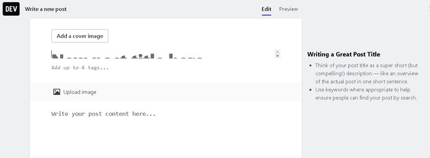
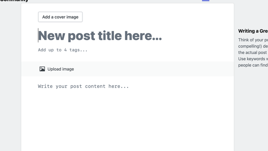
This PR fixes clipping of the title field on the /new view - caused by prefers-reduced-motion: reduce settings that we overwrite in our reset.
Before the fix:
After the fix:
 [15 mins fix] Title clipping on /new view for `prefers-reduced-motion: reduce` settings.
#12738

What type of PR is this? (check all applicable)
- [ ] Refactor
- [ ] Feature
- [x] Bug Fix
- [ ] Optimization
- [ ] Documentation Update
Description
This PR fixes clipping title field on /new view - caused by prefers-reduced-motion: reduce settings that we overwrite in our reset. Kudos to @benhalpern for finding the root cause of this bug since it's been open for several months and we couldn't find what exactly caused this behavior.
Related Tickets & Documents
- Closes #10114
QA Instructions, Screenshots, Recordings
- Go to your system preferences and find settings (in accessibility tab) related to reducing motion. check the checkbox.
- Go to
/newand play with the title field. It should no longer be clipped.
Before:
After:
Added tests?
- [ ] Yes
- [x] No, and this is why: not needed
- [ ] I need help with writing tests
[Forem core team only] How will this change be communicated?
Will this PR introduce a change that impacts Forem members or creators, the development process, or any of our internal teams? If so, please note how you will share this change with the people who need to know about it.
- [ ] I've updated the Developer Docs and/or Admin Guide, or Storybook (for Crayons components)
- [ ] I've updated the README or added inline documentation
- [ ] I will share this change in a Changelog or in a forem.dev post
- [ ] I will share this change internally with the appropriate teams
- [ ] I'm not sure how best to communicate this change and need help
- [x] This change does not need to be communicated, and this is why not: please replace this line with details on why this change doesn't need to be shared
Fix Frequent UI Issues After Deployment
This PR strips out some of our ReadableStream service worker functionality because it has been causing too many bugs related to the deployment of new code.
 Reduce service worker functionality to minimal offline page
#12834

What type of PR is this? (check all applicable)
- [x] Refactor
- [ ] Feature
- [x] Bug Fix
- [ ] Optimization
- [ ] Documentation Update
Description
This PR strips out some of our very cool ReadableStream service worker functionality because it has been causing too many bugs related to the deployment of new code.
The upside of this functionality is very instant initial page loads, but the downside to the current implementation is too many instances of difficult-to-predict deployment cache issues. These were always painful to deal with, but are exceptionally difficult in a Forem world where our devops cannot act quickly to fix production issues the same way we can with a single deploy.
The fundamental issue with our current implementation is just that it is not exhaustive in terms of dealing with certain scenarios, and dealing with edge cases creates a lot of complexity.
We suspect there are still UX benefits and SEO benefits to handling basic offline functionality...
And we still have our service worker lifecycle on top of which we may be able to methodically add back certain functionality that this PR removes, but we can do so with much more of an emphasis on ensuring all possible scenarios are accounted for so that we do not allow users to get caught in buggy situations.
One additional adjustment I made was just removing the "DEV" portion of the image on the offline page (and some code cleanup there)... We may want to offer a new fun way for Forem admins to customize this page, but I figured this small adjustment to make for a more minimal and generalized offline page made sense here.
Follow up
There is additional code that can be removed with this new approach, but due to the nature of how service workers run code already downloaded to user browsers (i.e. the cause of this complexity in the first place), it makes sense to wait at least a few weeks to remove some of the other code that is not needed anymore in case it could break old installs.
Related Tickets & Documents
https://github.com/forem/internalEngineering/issues/333
QA Instructions, Screenshots, Recordings
This is mostly an adoption of this functionality: https://web.dev/offline-fallback-page/
Eyeball the functionality and test different network conditions to ensure this does not cause new problems.
UI accessibility concerns?
This should not cause new a11y issues.
Added tests?
- [ ] Yes
- [x] No, and this is why: I'm not really sure how to test this.
- [ ] I need help with writing tests
[Forem core team only] How will this change be communicated?
Will this PR introduce a change that impacts Forem members or creators, the development process, or any of our internal teams? If so, please note how you will share this change with the people who need to know about it.
- [x] I've updated the [Developer Docs]











Top comments (3)
Yay!
Goood!
nice