Hey everyone,
This is Lisa (lead product designer) here. In an effort to bring more transparency to what we’re working on, why, and how we’re doing it, we’ll be welcoming you into our process.
Currently, we’ll be restructuring the Home Experience to resolve a series of product & technical issues that will establish a more stable product baseline upon which to extend functionality and iterate. After these initial changes, we can incrementally validate, build, and test these solutions.
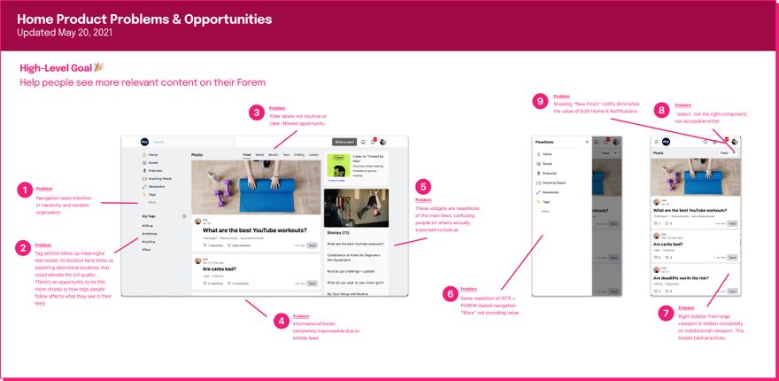
What are the current problems with our Home Experience?
See higher resolution image here
How we’ll be solving these problems
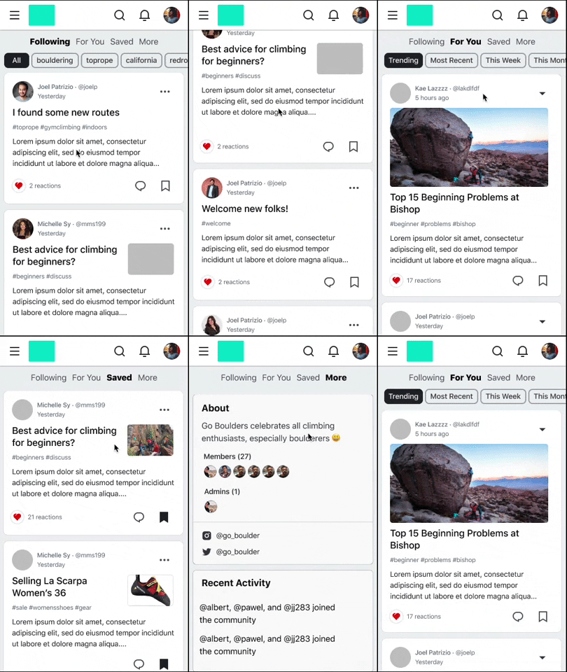
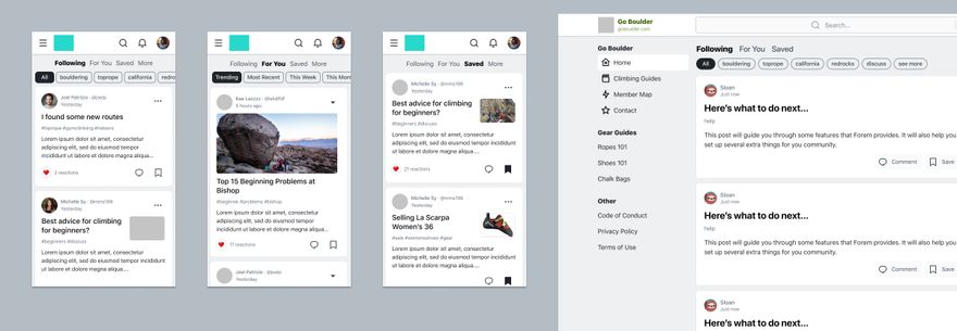
In a nutshell, here is the proposed set of updates we’re moving towards:
See higher resolution image here
These changes involve:
- Introducing a “Following” feed so that you can exclusively see posts by people and tags you’re following.
- Introducing the “Saved” feed that aggregates all of your saved posts (this also includes renaming our current feature from “Reading Lists” to “Saved”).
- Introducing a “More” tab that aggregates widgets you can set up as a Forem creator.
- Creating clearer site navigation sections so that people can easily scan its links.
Given that this involves a series of little changes, we’ve also begun outlining specific projects we’ll tackle and their dependencies to be most opportunistic in how we roll these updates out.
Questions for you
- What can we do beyond the changes we've already proposed to make our home feed 10% better?
- Which of these features are you looking most forward to?
- What kind of widgets do you envision Forem creators wanting in the “More” section?
- Do you have any other questions or comments for us? Drop a comment below.


Top comments (6)
Hey Lisa,
These proposed UX changes look slick!
What can we do beyond the changes we've already proposed to make our home feed 10% better?
Hot/trending/most popular posts - apologies if this is already there.
Which of these features are you looking most forward to?
The following feed
Feature request. Generate cover image & one-touch play from YouTube links.
Lee ・ Apr 7 ・ 1 min read
and this:
How to properly enable multiple call-to-action buttons in nav bar...
Ben Halpern ・ Aug 21 '20 ・ 1 min read
What kind of widgets do you envision Forem creators wanting in the “More” section?
Suggestions and ability to follow other members and orgs
Events
Realtime Podcast play with saved sync
Giveaways
YouTube playlists
Do you have any other questions or comments for us? Drop a comment below.
Yes you are all awesome! Keep up the innovation, incredible. Really looking forward to seeing the roadmap, my top 3 requests are editor simplification, profile generalisation and multiple content creation options 😎👊🤓❤️
Hello @lee :)
We're taking care of this with the "For You" tab, which defaults to the "Trending" sub-tab so that you can discover new, interesting content.
The 2 ideas you shared around "generate cover image & one-touch play from YouTube links" and "enable multiple CTA" are things I see belonging to this broader initiative to optimize the composer experience for people to create and share content. You may have already been looped into related conversations about making our composer more friendly to non-devs, and I see these ideas all tying together... Our design team will do an ambitious design exploration combining these various ideas so that we can see the end-goal, and we'll create a post like this one :)
I'm super hyped for these changes - they seem like they'll help make browsing for new articles to read easier and more enjoyable!
I'm extremely interested in finding out more about what exactly these are - Is this for my most valued analytics that I like to see at a glance? A saved bundle of specific articles that I like to share together? A subsection of listings that I like to browse through periodically? 👀
Thanks @tyler for asking some of these questions! The very open-ended questions are exactly what we're looking for at this stage to determine what could be the most useful widgets serving your need. Imagine an ecosystem of widgets you can toggle and setup based on your Forem's needs.
Thanks for the ideas!
Nice move for that.
For tags listing at the left, why do not add colors of the tag inself ?
What kind of widgets do you envision Forem creators wanting in the “More” section?
All the people we follow through the Forems
We'll certainly explore using the tag colors, thanks for the suggestion!
One of the considerations here is making sure that the colors we use remain readable. So, that means we'll want to ensure that tag colors look good on the gray background (as well as in other color schemes). If this becomes overly complicated and does not look aesthetically good, that's where it might be preferable to stick to a simple, safe color. We'll see in further design explorations where we land. Thanks for the suggestion!