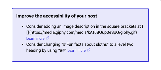
I'm pleased to share that we've shipped a new feature for the Post Preview page!
Whenever you preview a post you're working on, you will now see up to three suggestions for how you might improve the accessibility of your post.
What is web accessibility?
People access online content in all kinds of different ways, including making use of assistive technologies like screen reading software.
If you'd like to read more about this, have a look at W3C's Introduction to Web Accessibility, which has some really great background.
At Forem, we're committed to supporting inclusive communities, and we hope that this feature will empower Forem members to boost the accessibility of their posts by suggesting small tweaks to drafts.
What kind of suggestions will I see?
The suggestions you'll see surfaced in this new feature currently fall into two categories:
- Alternative descriptions for images
- Heading structure
Alternative descriptions for images
Some users might not be able to see or easily process images that you use in your posts. Providing an alternative description for an image helps make sure that everyone can understand your post, whether they can see the image or not.
Alternative descriptions for images can be added inside the square brackets of an image added in markdown - e.g:

The Post Preview page will now let you know if any of your images are missing an image description.
Heading structure
Headings provide an outline of your post to readers, including people who can't see the screen well. Many assistive technologies (like screen readers) allow users to skip directly to a particular heading, helping users find and understand the content of your post with ease.
Headings can be added in levels 1 - 6. When you create a post, your post title automatically becomes a level one heading and serves a special role on the page, much like the headline of a newspaper article. Similar to how a newspaper article only has one headline, it can be confusing if multiple level one headings exist on a page, and so the Post Preview page will now let you know if you have created a duplicate level one heading.
Heading levels should only increase by one at a time, when sub-sections are added, for example:
## Fun facts about sloths

### Speed

Sloths move at a maximum speed of 0.27 km/h!
The Post Preview page will now suggest if a heading level could be changed to create a more coherent document outline.
Updates to the editor guide
Finally, you'll also find a new section of the editor guide dedicated to accessibility with more background information and detail on all that's mentioned in this post.


Top comments (7)
Wow, I've been so wrong about this! I've been using H1 headers in my post all the dang time and thought this way was more accessible. Thank you so dang much for setting me straight!
Also, love love love this update.
I love that you have added these changes.
I am not sure whether you should cross post from dev.to or not (if so let me know and I will copy the post here as I think people may find it interesting) but I have a half finished WYSIWYG that doesn't include a
<h1>for the exact reasons you mentioned and a better (in my opinion) way to handle images to ensure alt tags are remembered.dev.to/inhuofficial/dev-to-markdow...
It would be interesting to see what people thought about it.
This is great! Our product team is definitely looking at ways to make the editor more user-friendly, especially for users less familiar with markdown. We'll be keeping accessibility in mind as we look at this, and I like your suggestion to have an intermediate step for image upload that would help encourage alt text.
One challenge that we have is that users can also directly in-line images without uploading them to the given Forem (perhaps most common with gifs from giphy etc), which we can still catch with this "accessibility linter".
Lots of food for thought in your post, and we'll definitely be keeping these ideas in mind as we go forward - thank you for the feedback!
No problem!
Yes I understand the pain you must all have trying to lint the direct input...One of the things also holding the next stage up (other than time) is that I want to implement a live preview on desktop and I have discovered the joys or parsing Markdown! I do not envy you!
Perhaps the solution (as a toyed with the idea) is to have a completely different editor for those not familiar with Markdown...just a traditional WYSIWYG and then the linting can be done on the fly? Just another difficult idea to add to the pot and make your life harder 😋🤣
I decided to post the idea as a cross post also just to make it easier to reference.
I've got a question about this Forem.
Why the logo Is not the same for all website ? 😖
We're uh.. ummm... working on getting that squared away.
aha xD