For anyone interested in contributing to the frontend of Forem, our Storybook is a really helpful resource - and it just got better 🎉
Wait, what is Storybook?
Our Storybook collects functioning examples of our "Crayons" design system components, along with accompanying notes about how to implement them.
Tweaking the component
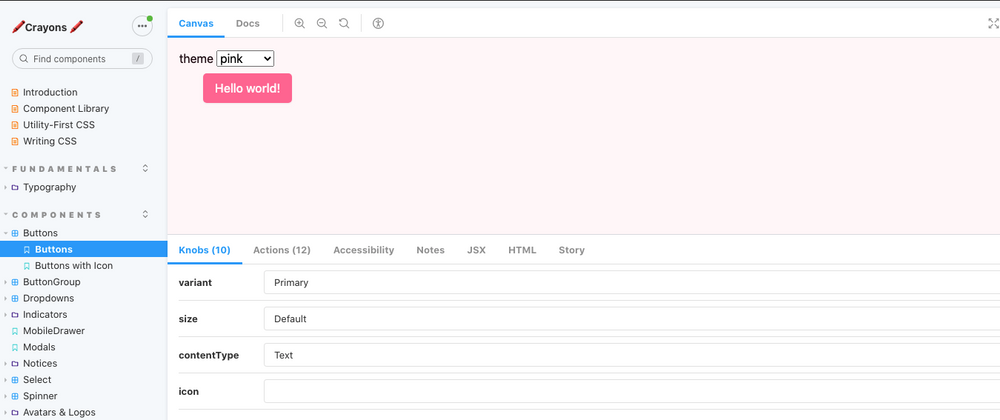
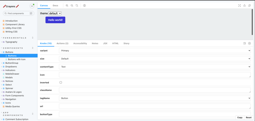
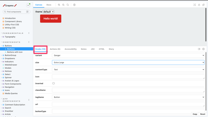
You can use the "Knobs" section to change the various settings for each component (e.g. size, variant, additional class names).
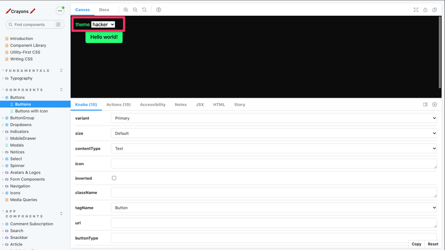
Viewing in different themes (recently fixed! 🔧)
You might have noticed that users can select from multiple "themes" in their Forem settings, which changes the colour of many of these components. To see what a component looks like in different themes, you can use the switcher at the top of the page:
Copying the markup (NEW ✨)
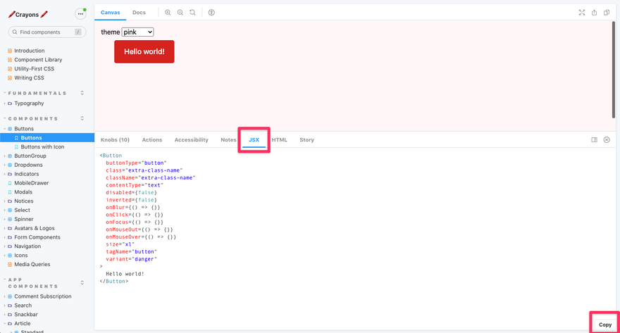
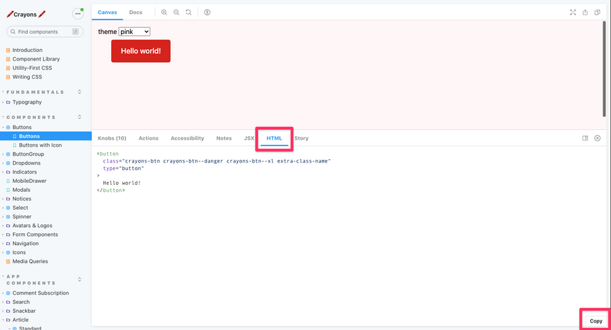
Once you've experimented with the settings for your component, you're now able to copy either the JSX (if you're using the component in a Preact area of the codebase), or the HTML markup, ready to paste directly into the code you're working on!
All of the customisations you added in the "Knobs" section will be reflected in the copied markup, meaning you don't have to worry too much about classnames or props 🙂
To view and copy the JSX, click on the "JSX" tab:
To view and copy the plain HTML, click on the "HTML" tab:
Hopefully these new features should make contributing to the frontend of Forem that little bit easier, and we're looking forward to enhancing these docs more in the future 🚀
Happy coding!

Top comments (3)
This particular change will only impact developers being able to preview how a component looks in different "out of the box" themes. New users of a Forem will continue to see the default theme first, but if there's a customization you think would be useful here, you can always post a feature request to let us know!
This is awesome!!
Love this addition! Nice work @s_aitchison !