Background
You might have noticed recently we've been focusing some effort on both fixing historic accessibility issues in the codebase, and also optimising some features in terms of accessibility.
In the last few months this has included work such as:
- A revamp of all modals with proper focus management
- Changes to design-system dropdowns to ensure focus management and expanded/collapsed state being communicated to screen reader users
- Adding skip links to our pages to make navigation by keyboard more streamlined
- Updating our navigation "tabs" component to communicate the currently selected page to screen reader users
- Adding an accessibility linter for posts
Auditing the "Like and share an article flow"
As we continue to focus on accessibility enhancements, I thought it might be interesting to share how I would go about auditing a user flow with screen reader users in mind - so I've recorded myself doing just that!
The user journey I'm auditing is:
- Select a post from the home feed
- View the post
- Like and share the post
I'm using VoiceOver on Mac (the default built-in screen reader), and I'm auditing the flow on the DEV Forem.
Outcomes
If you watch the video, you'll see that I was able to successfully complete the actions I set out to do, but there were a couple of friction points in the journey:
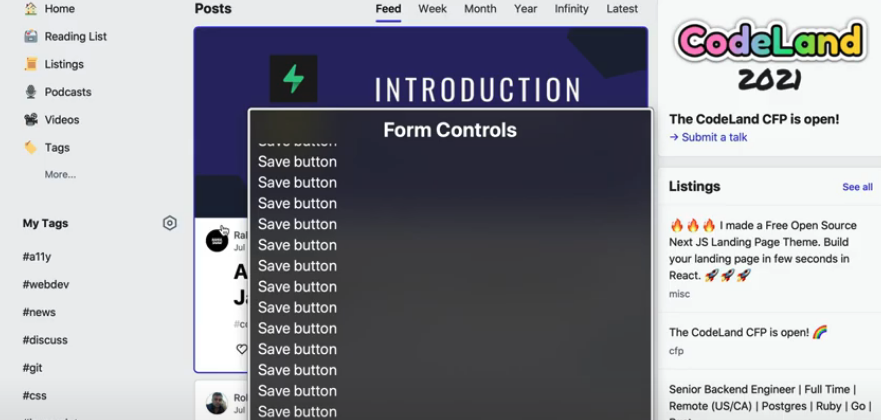
- Each "story" card in the feed has a lot of links, many of which point to the same destination, or have slightly confusing labels
- Article "Save" buttons all have the same label, leading to a long list of indistinguishable "Save" controls being surfaced
- Skip link functionality didn't behave as expected when I moved to the new page (an open issue already exists to look further at this functionality)
- I didn't receive any feedback after liking the article
As a result of this audit:
- I've started discussions internally via our RFC (Request For Comments) process on how we could streamline the home feed cards
- I raised a small issue for enhancements to the reaction buttons, which has already been implemented by one of our amazing community contributors 😄

Latest comments (4)
Great watching you find your way around with a screen reader and spotting the problems.
As for reaction components I had a fun discussion in the comments section of this article dev.to/madsstoumann/building-a-rea...
One concept (that I would need to improve if it was go to production) that would work is to not use a button at all. As this is a state (on-off) component an
<input type="checkbox"could be more appropriate.It also exposes the number of likes which is something you currently do not get with a screen reader and exposing this information will make your process of making this accessible way more difficult as you need to then to update the number of likes in a way that actually gets read out by a screen reader...which is probably going to require
aria-liveto work consistently.I stole the styling so this isn't production ready but it works as expected for a screen reader user:
Link: jsfiddle.net/gyqunr8c/1/ (the fiddle below isn't working for me?)
Explanation
We use a couple of tricks.
First we use
aria-labelledbyto ensure that the control is labelled correctly. We use several different elements in order to construct the full name so that we only need update the span containing the number.We also add extra information using visually hidden text to describe the current stats to screen readers without changing the visual design.
Should
arianot work in a particular screen reader there is still the same information within the label, but in the wrong order. I also use thetitleattribute on the span and make sure we use a<title>element within the SVG so that when you hover them with a mouse the icons are explained (as ideally you would have visible labels for people with cognitive impairments who may not be able to make associations between a unicorn and an upvote for example).Not quite perfect, but I will put an article together with a full recommendation if changing the control to this format is a possibility.
Sorry that the inline SVGs make it hard to follow, the only thing you really care about are the
<input>, the<title>within the SVG and the nested<span>after the SVG.Thanks for the suggestion and insight! We're currently running with making buttons like this toggle buttons to convey the selected/unselected state to screen reader users.
We did consider checkboxes, but in the end decided against them because:
We weren't keen to use form controls outside of a form with a submit trigger. For someone without the visual context, we were concerned this would be an unconventional/unpredictable behaviour for a checkbox, which usually wouldn't be expected to trigger an immediate action
For users who navigate the UI by keyboard but don't use a screen reader, using checkboxes wouldn't (by default) give the expected experience, since they are 'checked' by the
Spacebarkey. It's not insurmountable but it felt like we would be adding additional code to simulate the behaviour of a button, so why not use a button 😄Let me know if there's a reason you'd favour a checkbox over a toggle button - we're always open to suggestions and appreciate the feedback!
It was down to support of
aria-pressed, however my notes were out of date and after a retestaria-pressedworks fine (95%+ compatibility) for definitive states (true and false work for the value, mixed doesn't work well but that isn't relevant here).The pattern in inclusive components works fine (which variation are you using?).
The biggest issue with the button is the same as addressed in my example, you have no information on current number of likes that is meaningful. Also when you change the state what is announced will be an interesting challenge.
My apologies for adding confusion, it is difficult to test things more than once every two years due to the number of screen readers and versions and at last check it was only 85% compatibility (checkbox is 100% as you can imagine) but some really old versions are no longer being supported / work properly so it is fine now!
Looks like I need to go and retest a few other things so I am not giving bad advice based on out dated information!
The approach we're following is:
You're absolutely right and I think it's something we'll need to think about a bit. As you mentioned, an
aria-liveregion when the network request succeeds is one option. At least if we update these to toggle buttons, the user now has some feedback on their action, which is an improvement over the current implementation.As a bit of additional context we're also looking at this pattern for follow buttons in the app which currently suffer from the same problem. Keeping the approach consistent across on/off buttons like this will hopefully make things more maintainable (that's the hope anyway!).
Not at all! Definitely keen for input in this area - like you say it's almost impossible to keep completely on top of everything and we're more likely to arrive at an approach that works well if we all communicate and share expertise 😊 Really appreciate you taking the time to feed in!