Feature request
Summary
Add a previous/next button at the bottom of a series article that facilitates navigation.
Why is it needed?
When reading a series of posts, especially when we are in the middle part, we need two clicks to move to the next post if we want to continue:
- Expand the series navigation
- Click on the following article
And that's not counting that when the navigation expands, it doesn't scroll to the current article position, so in between those two clicks, we still need to scroll to find the current article –which can be a pain in long series.
If the user has fat fingers (as I do), they may click/tap on the wrong article and restart the process after the page loads.
Suggested solution(s)
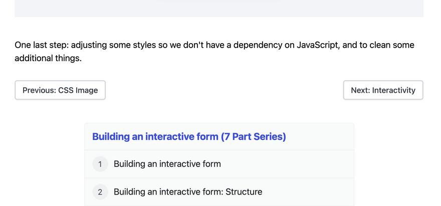
Adding previous/next links at the bottom of the article would simplify the navigation process: reduce the number of clicks and time spent searching for the next part in the series.
It would be two (or one if we are on the first or last article) links:
<a href="...">Previous</a>
<a href="...">Next</a>
It could include some semantics too, by using the rel attribute to indicate that it is the next/previous element in the series:
<a href="..." rel="previous">Previous</a>
<a href="..." rel="next">Next</a>
Also, if there's space, the text could be expanded to include the title and build interest:
<a href="..." rel="previous">Previous: [title of previous post]</a>
<a href="..." rel="next">Next: [title of next post]</a>
Then style it to look not-exactly-like-a-link (e.g., maybe like in the style of the "Unsubscribe" button):
Related issue(s)/PR(s)
I didn't find an issue/PR for it. (I may need to improve my search-foo, I'm surprised no one at least suggested it before.)


Top comments (0)